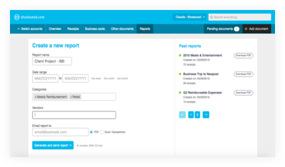
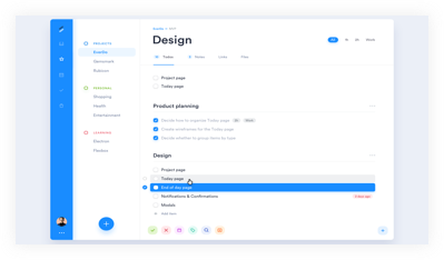
Receipt Bank Web
CASE STUDY
CLIENT
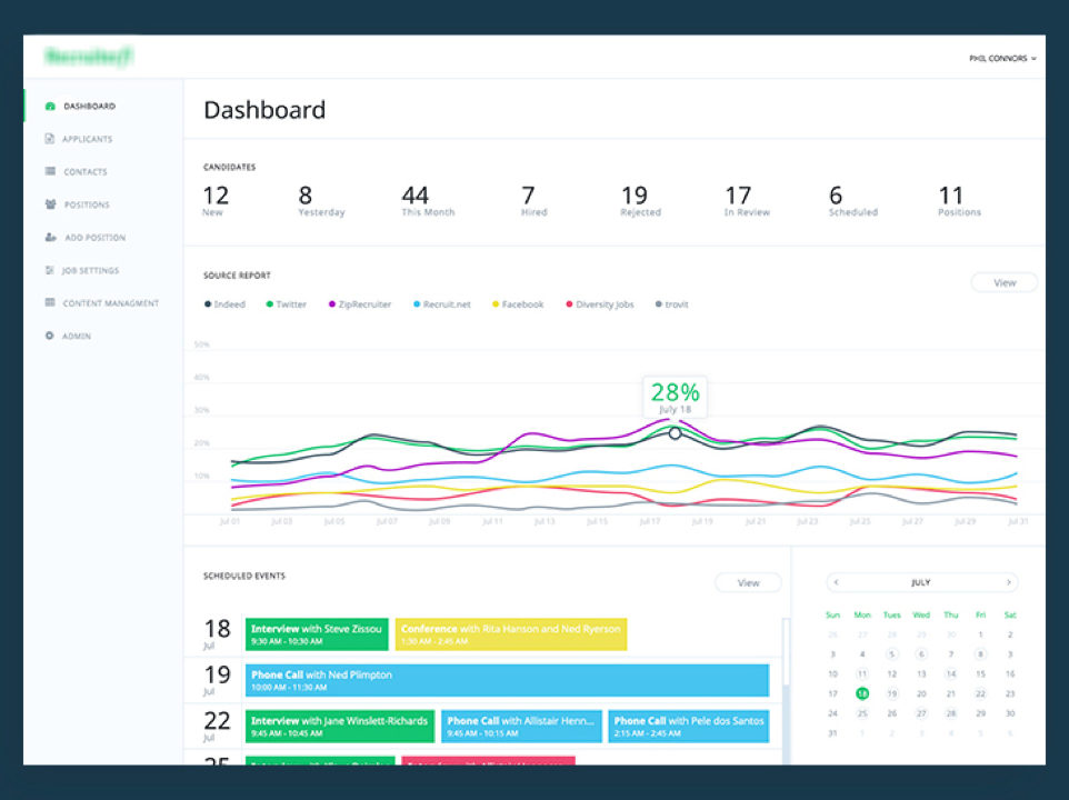
Receipt bank
TARGET
SME corporations
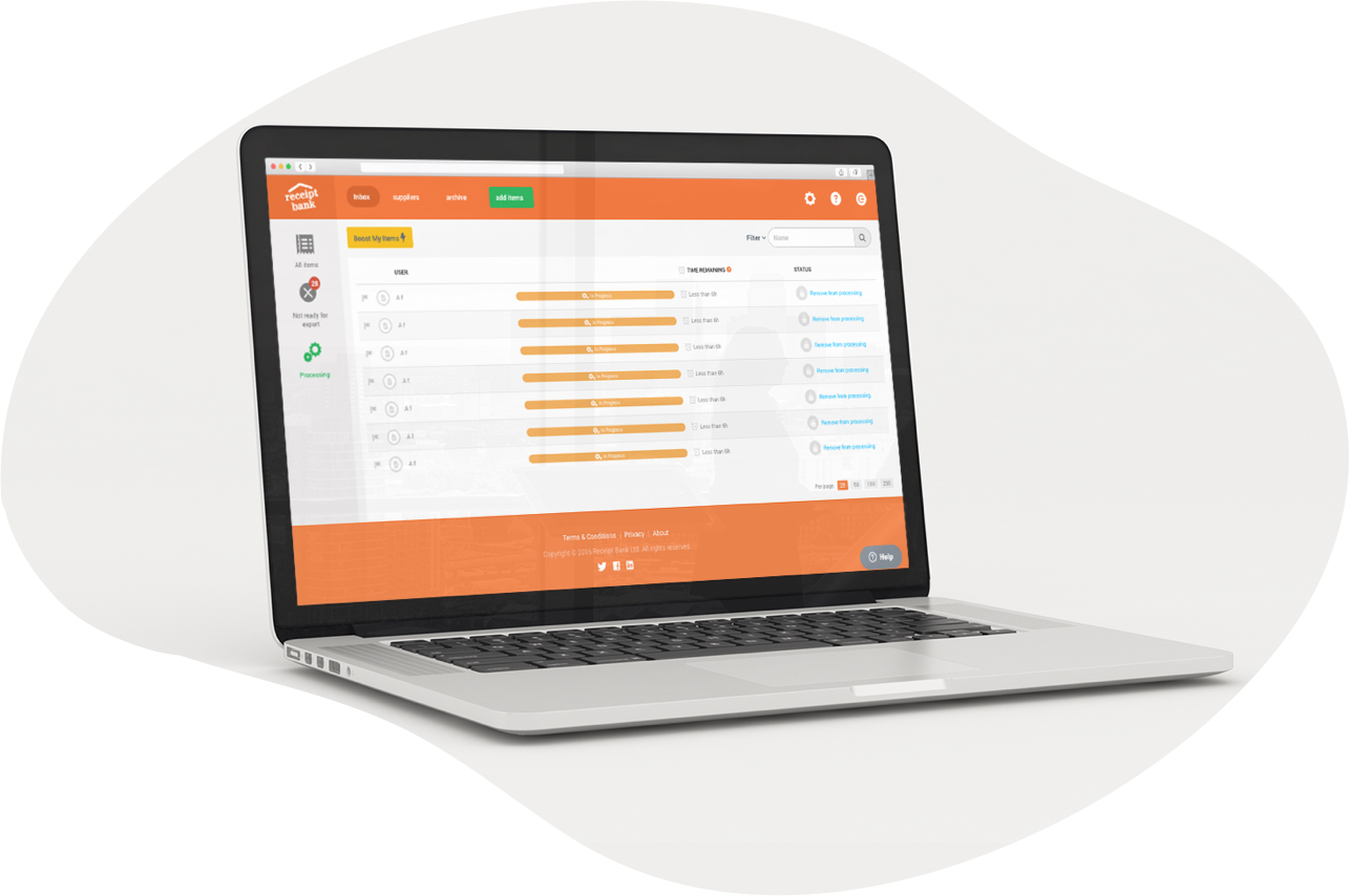
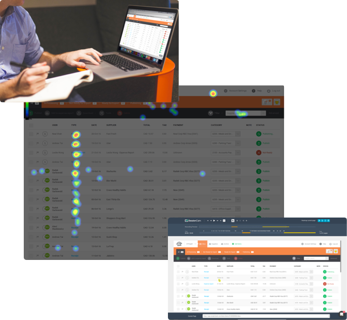
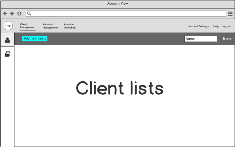
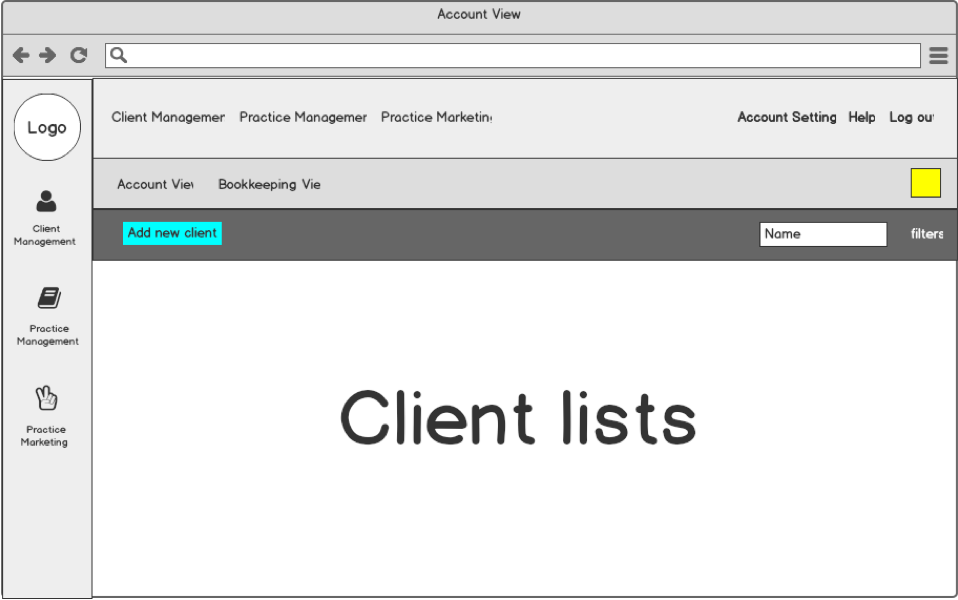
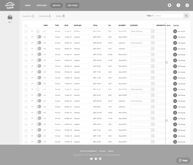
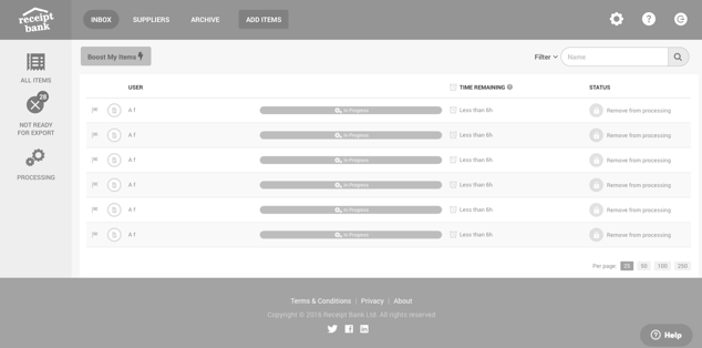
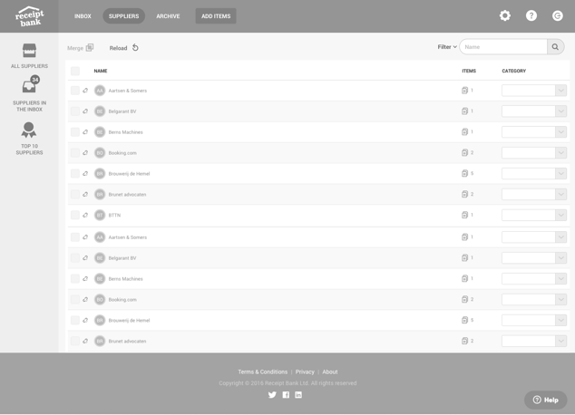
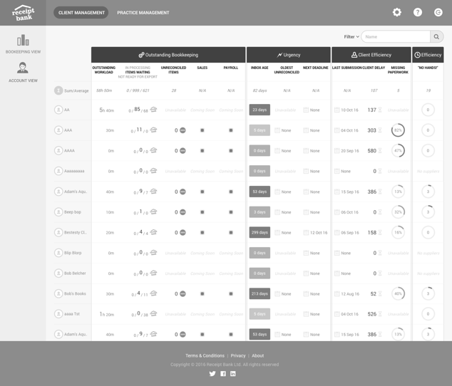
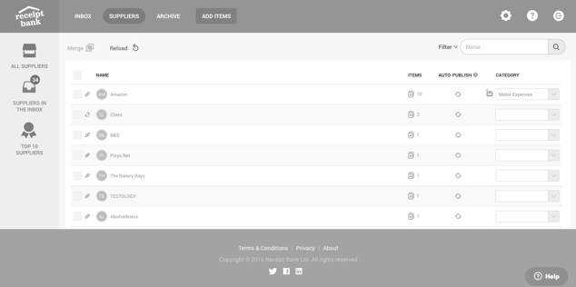
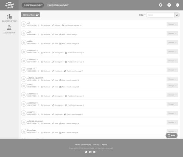
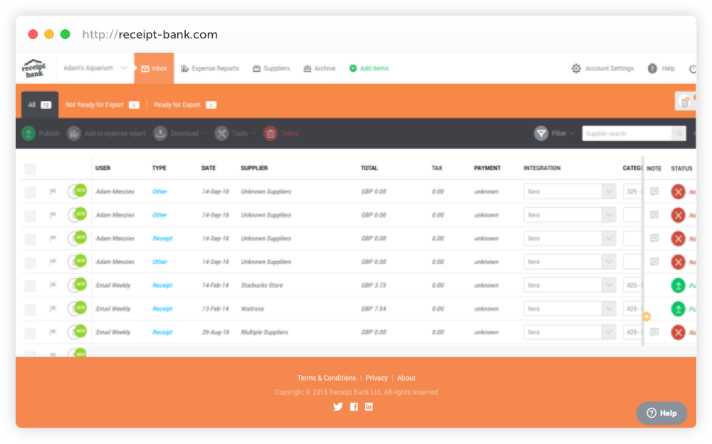
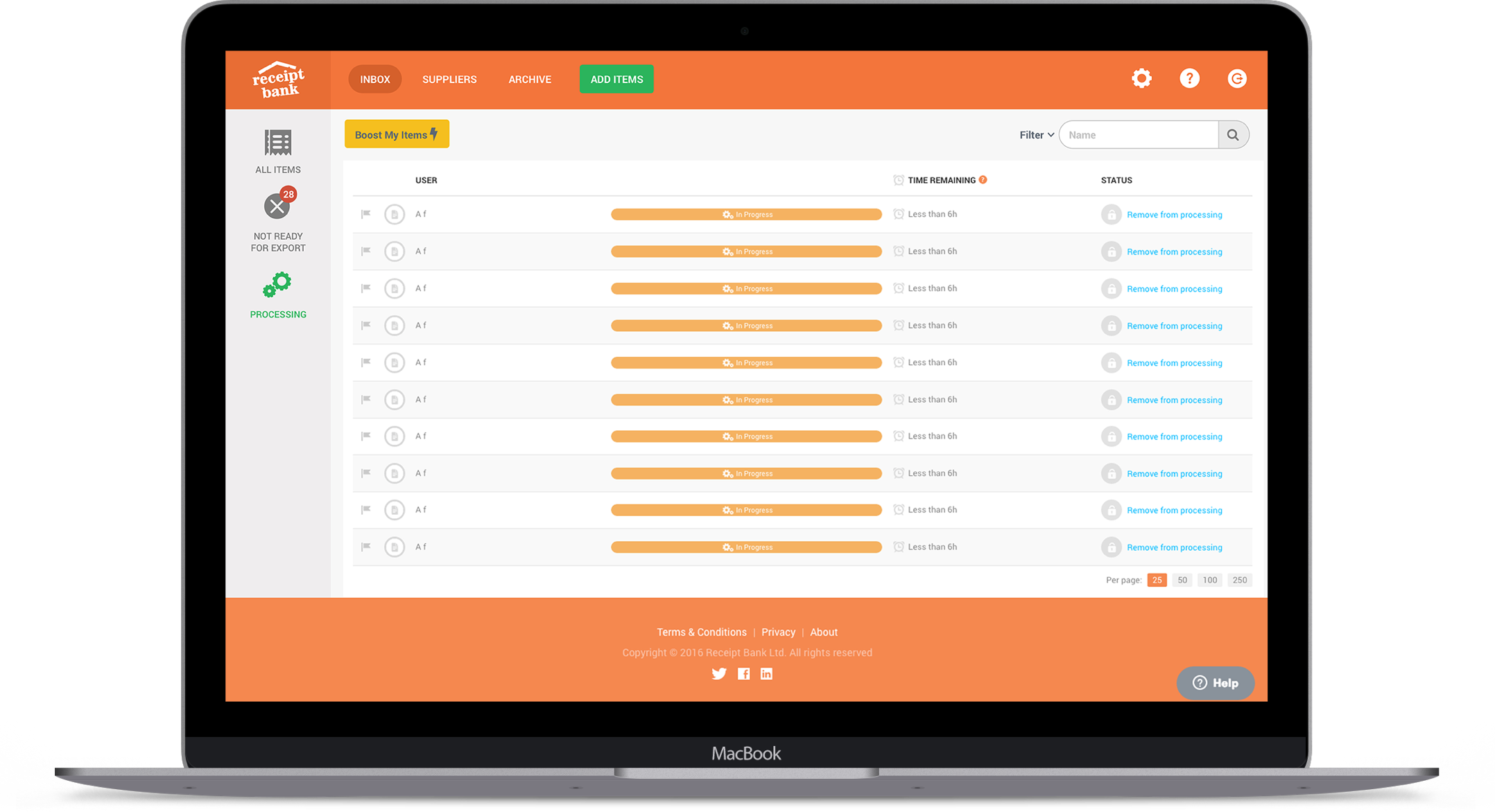
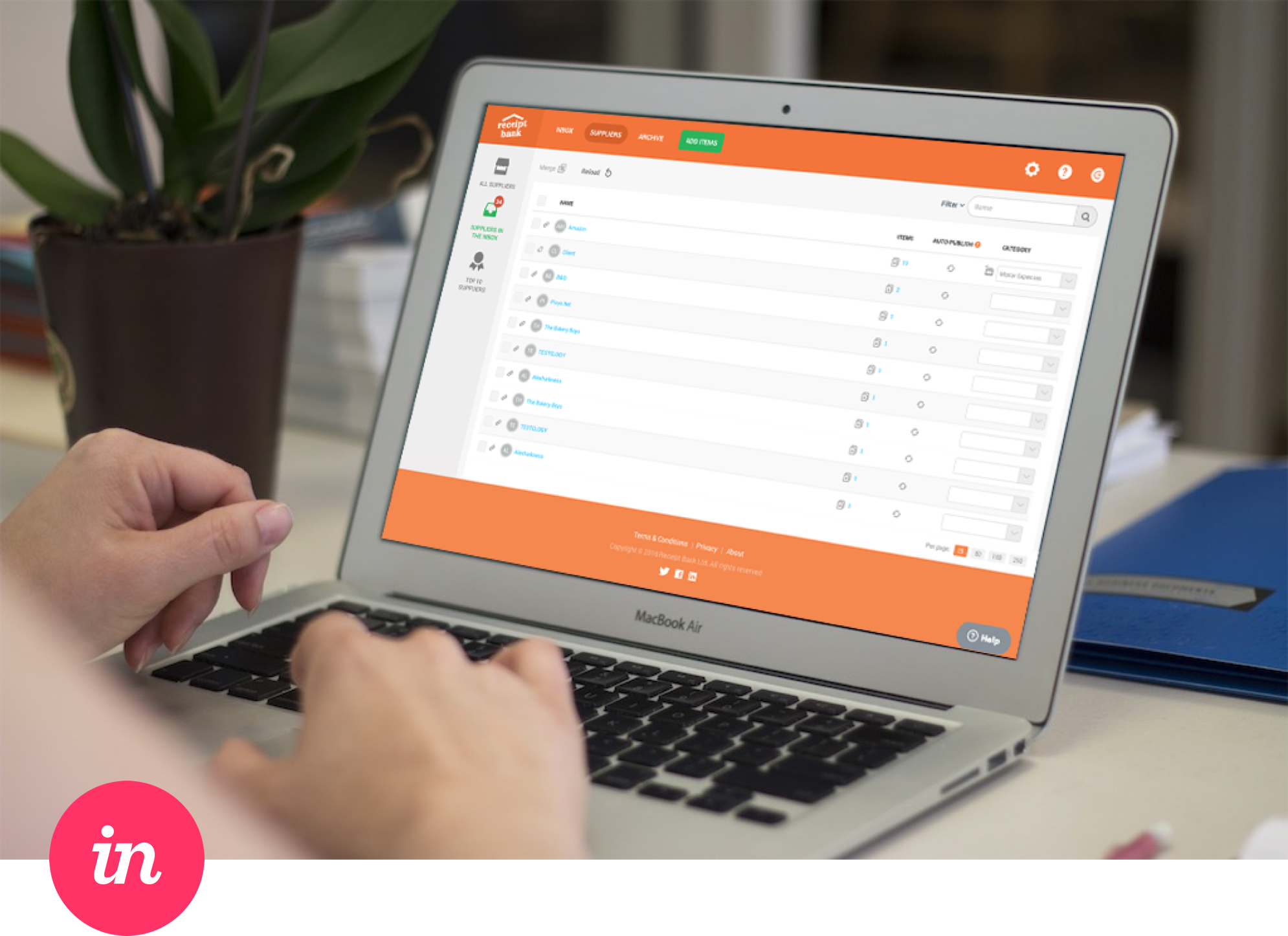
Receipt Bank are a fast growing fintech start-up company. The product is made up of a web and mobile application, which serves two types of users; accountants and their clients which they represent; their ultimate goal is to automate bookkeeping.
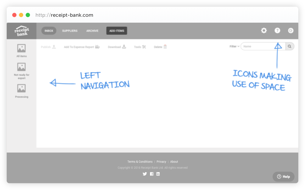
This case study demonstrates that through correct user research, good design principles and user testing I was able to improve the navigation stack of the web application.
ResearchUI DesignUXWireframingWeb
.png)